I want to take a moment to announce the relaunch of moveseniors.com. The previous iteration of this website was confusing to navigate, visually unappealing, and lacked a sound information architecture. Important content was difficult to find and a wealth of text was rendered as images—hidden from search engine spiders. Our goal with this redesign was to improve SEO, ease of navigation, accessibility and overall friendliness
The site needed to provide resources for aging adults transitioning into smaller homes while also serving as a training portal for aspiring senior relocation professionals. My roles in this project included information architecture planning, front end design, (X)HTML/CSS construction, Javascript implementation and content management. Click here to launch the site.
March 26, 2009
MoveSeniors.com redesign
March 25, 2009
Moved by type
Beautiful typography, thumping backbeats, retro aesthetic. Does it get any better? This "typographic orgy" from Sebastian Lange rocked my world when I first saw it. Clearly I'm a sucker for typography in motion. But this video experiment for the song "flickermood 2.0" by FORSS turned me into a full-blown junkie.
March 7, 2009
OwensArtwork.com Gets Painted Anew
As a gift to my good friend and celebrated artist Matthew Owens, I offered to redesign his website. The previous iteration didn't reflect his sense of style or personality in the least. It felt like someone altogether different—a crafty homebody masquerading as the erudite, talented and slightly peculiar artist that many Chicagoans know and love.
Unfortunately, politics got in the way of launching the redesign and kept it in a holding pattern for the last year and a half. That is, until today. The new version of owensartwork.com launched with dark motifs of moody grays, painterly details, and a background scanned straight from a Jean Paul Gaultier shirt—nothing could be more Matthew than that.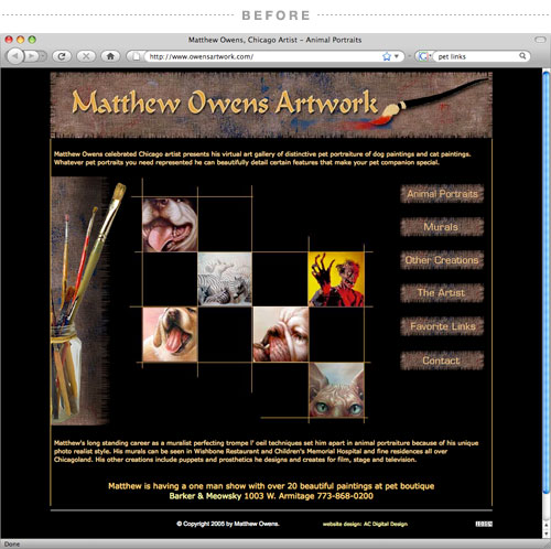

February 20, 2009
Julie's Pseudo Birthday Gift
We all have tough months. Mine was February. The aftermath of the holidays, some unexpected expenses and a dip in freelance work left my wallet thinner than usual. I can handle living on a shoestring. However, my fiancée's birthday just happened to coincide with this perfect storm of financial wallops, leaving me empty handed in the gift department. Not good. So this year, in lieu of an actual gift, I designed her this five panel, vertical accordion folding card and she loved it.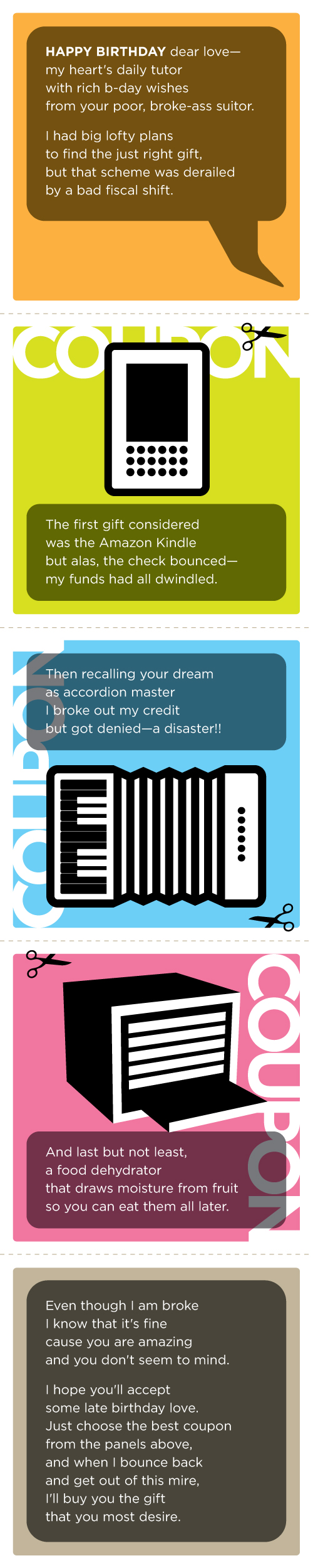
December 18, 2008

April 4, 2008
Illustrating the Holidays
On a rare occasion I get to wear the hat of an illustrator. Its something that I always enjoy, but hardly ever have the opportunity to do. Consequently, I've never developed my own style of drawing. Yesterday I was asked to create some holiday related marketing pieces. The client was intent on focusing the design around highly obvious holiday subjects: Santa, turkey, fireworks, and so on. I learned quickly that the royalty-free stock photography reserve of holiday themes is just downright bad. I figured, the only way to make this project work without compromising too much on aesthetics was to embrace the cliche and illustrate them by hand. Here are a couple of the illustrations that were settled on:

March 25, 2008
The Propagandizer is back
 I've been ignoring my obligation to provide society with more propaganda, political and otherwise. But at the urging of a good friend and mentor, I finally got off my lazy butt and designed up some new spin for all to download and paste up in their neighborhood alleyways, coffee shops and store fronts. To see the latest blitz of social manipulation from Studiostein, go to www.propagandizer.blogspot.com.
March 7, 2008
Revolution
Here is my Word It submission for March. This month's word is Revolution: a forcible overthrow of a government or social order in favor of a new system. I had actually been developing this icon as a new logo for the Propagandizer, but decided instead that it was better suited for this purpose. Enjoy.

December 12, 2007
What type am I?
 My obsession with Typography is overwhelming. I often interrupt my girlfriend, Julie, mid-sentence to enthusiastically point out a billboard type treatment or poor use of Helvetica on public signage. She humors me by feigning genuine interest, and I appreciate her all the more for it.
The latest trend in typography; chunky, geometric, illustrative wording with the counters removed, has me both enthralled and perplexed. When executed well it can make a bold graphic statement, but it also has the allure of a fad so ostentatious that it's days are numbered. In spite of my better judgment, I found myself so caught up in this über hip typographical style that I started re-designing the Studiostein logo in it. It took me only about an hour to render all the letterforms—an indication that this style doesn't require exceptional finesse. I knew there was tweaking to do, but I felt confident in the design overall. So I presented it to Julie, who I jokingly refer to as my Art Director (I pretend it's a joke, but she's actually very deserving of the title) and waited with baited breath for her response.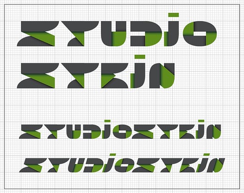
Okay, my breath wasn't actually bated. I knew Julie would see through the stylistic excess and realize that this type treatment didn't actually connect with the Studiostein identity. She was right.
Eye magazine creative director, Nick Bell, wrote that there are two types of designers; "agents of neutrality" and "aesthetes of style." While I often fantasize about being the latter—designing exclusively for the sake of expressing my raw creative vision—I think it's more accurate to concede that my purpose as a designer is to communicate the client's message. I reserve self gratification for one side project in particular: The Propagandizer.
While I'm still trying to develop a unique visual language to call my own, this exercise (and Julie in particular) helped me remember that my style isn't dictated by fads. I think it's critical to stay current on design trends and to incorporate them sparingly, but in the end they all pass.
November 26, 2007
Studying Schwab
Back in school we used to get away with replicating other artists' signature styles by deeming the work a "study". This practice was often encouraged, but as we became upperclassmen with unique visual styles of our own, it died out.
For this year's holiday card Julie and I decided to revisit this activity and borrow the charming and timeless look of Michael Schwab's illustrations. While I will refrain from posting the finished card design, here are the studies: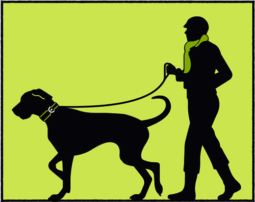
November 15, 2007
Word it for November
Drumroll please…here is my Word It submission for November. This month's word is Next: coming immediately after the present one in order or space. As if enough typographic solutions to "next" involving arrows and X's hadn't already been submitted, I proceeded boldly with my own take on the arrow-X treatment. Is this X headed in next, or is it headed out? Ponder that.
November 4, 2007
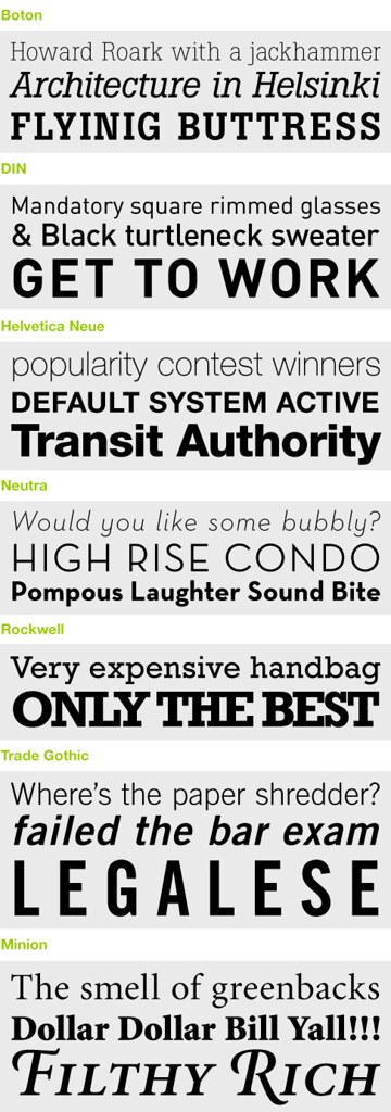
My Favorite Typefaces
My original intent was to begin this post with a butchered rendition of "My Favorite Things" reinterpreted to express my love for all things Type. But I figured everybody involved would be better off if I forgo the shenanigans and dive straight into the post. There are many typefaces that I love, but these are some I've found popping up in my work frequently over the last five years. The obvious trend—lots of slab serif or no serif at all.
October 8, 2007
Studiostein Has Arrived
 If you've spent any amount of time exploring this blog, you've likely been directed toward a rather sub-par holding page at studiostein.com. Well, I'm happy to say that the site is now complete—ish. Over the next couple of months I will be making minor updates: creating a flash image scroller on the "Work" page; updating the portfolio; adding case studies; and more. Take a look around. If you come across any typos or grammatical errors—and you probably will—please let me know.
September 6, 2007
Serendipity
Here is my Word It submission for September. This month's word is Serendipity: the occurrence and development of events in a happy or beneficial way. I took a very simple approach to this. Enjoy.

September 4, 2007
The Propagandizer
 I just want to take a moment to announce a new project that my girlfriend Julie and I are starting called the Propagandizer. Click here to check it out. Spurred by the fulfillment of designing the 9/11 General Strike Poster, we are launching this project as a small contribution to a world desperately in need of change. I for one have never been the type of activist to march in rallies, stage sit-ins or throw eggs at the presidential motorcade, so we believe this undertaking will drown out any other attempts we could make to have our voices heard.
On a continual basis we will post original propaganda that you can download, print & post in your neighborhood if you are so inclined. If you disagree with the point of view expressed by the Propagandizer, let us know (as I'm sure you will). If you wish to contribute your own propaganda, please do so. Prepare your artwork as a PDF file and email it to this address. Please keep the file size below 5MB.
August 26, 2007
Day of nothing
I don't delude myself that visitors to this blog want to read about my political leanings. This little corner of the internet is about design, not politics. I am neither learned in the political sciences nor thoroughly up to date on world affairs. My political convictions are based largely on what I hear on NPR a couple times a week, what I see in the headlines of CNN.com, and what I feel in my gut when I take all this, and much more into consideration. That being said, I promise to keep all political ramblings to a minimum.
At the urging of my gut, and aided by a strong desire to do more "extracurricular" design, I created this poster to promote the 9/11 General Strike. Whether or not they include it on the official website for download by the public is yet to be determined, but you can download the full size PDF here, print it and post it in your neighborhood if you are so inclined.
Regardless, it felt good to break from client projects and create something that reflects my personal convictions. While I don't think that design alone can change the world, I do believe that it is a critical tool in bringing about political, social and environmental progress.
July 13, 2007
Coke vs. Pepsi (Aesthetically Speaking)
Less is definitely more. The Coca-Cola Company proved that with the recent enema it performed on the famous Coke can. This simple redesign turned out to be one of the best product packaging overhauls of the last several years, and it is one that will go largely unnoticed by the general public. Instead, consumers will experience a barely detectable sense of nostalgia and perhaps an enhanced connection to the bubbly beverage, and nothing more. Why such a slight consumer reaction? Rather than slapping swooshes, splashes and halftone patterns onto the design, they removed extraneous design elements and, in so doing, returned the Coke can to its long-ago simple glory.
In a marketing milieu where corporations flood the public with visual noise, a move like this from such a large player should be applauded. Now Coca-Cola actually deserves the name "classic".
On the other end of the boxing ring stands Pepsi. Now I should probably mention that I have little conviction about which is a superior soft drink. My girlfriend Julie feels very strongly that Coca-Cola is the apex of all beverages. Because of this, no Pepsi can has ever seen the inside of our refrigerator. That notwithstanding, Pepsi's latest marketing effort takes the exact opposite approach as Coca-Cola, and quite frankly their new cans turn my stomach.
Adorned with flashy, urban patterns this suite of 15 unique designs attempts to speak directly to young consumers in what Pepsi calls "a salute to the spirit of youth and discovery". Unfortunately, these cans only succeed in widening the gap between mega-corporation Pepsico and it's consumers by trivializing youth culture with graphics of car rims, snowboarders and DJs. For Pepsi's full spectrum of youth culture clichés, click here.
July 11, 2007
The news never looked so purdy
Before I dive into this post, I'd be remiss not to make a quick address. I'm a bad blogger. It's true. The only excuse I can present for being such a sporadic author it that, at the detriment of my blog, I've been highly productive in other areas of my life. So to any of you out there who actually look forward to my posts—if there are any of you out there—I apologize for keeping you hanging.
Back to the news. I have an online fetish. It doesn't involve web cams, internet porn, or Myspace. No, this is much more highbrow than any of that. It's the news. CNN.com to be exact. Why the sudden interest in world affairs? Well, its never looked so darn good before. CNN.com went live with their newly designed website early this month and has set a new standard for news coverage on the web.
I won't even begin to mention the myriad technical ways that the site has been improved. For more on that check out Andy Rutledge's article "Quiet Structure". I will however say that CNN definitely knows how to clean shop. The ease of understanding has been vastly improved. Before the viewer would have to tediously sift through the stacks of often strangely worded headlines. Now, with so much less visual noise, the content finds you. This transformation perfectly illustrates the value of thoughtful design.
May 15, 2007
Web 2.0, I love you
 Just a quick memo to proclaim my love for the era of immediate information. I'm smitten with the Internet. I love it in the same way I love my bicycle or Dunkin Donuts coffee. It's always there, ready to take me new places, show me new things and answer my questions. It's my professor, my doctor, my tour guide, my mailman, my megaphone, and my community.
Whether this is good or bad for the other relationships in my life is a question for the true, living-breathing apple of my eye, Julie. But I must admit that my infatuation with the Internet is long-standing and still going strong.
On a side note, you can now check out my fickr photostream by clicking on the flickr badge in the sidebar. Meet our menagerie of pets and catch a glimpse into the daily goings-on at the Weinstein/Vazquez household.
May 13, 2007
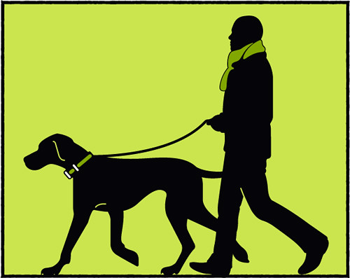
Labor of love
I'd like to take a moment to announce the website redesign of my girlfriend Julie's pet care business, Park Place Bark. While I still have a lot to learn about web design and development, I progressed leaps and bounds while working on this site. The original site was thrown up in a matter of days. Built with tables, cumbersome images, and shoddy code, it was in need of a revamp.
With the help of css, Park Place Bark now has one of the most sophisticated websites in the Chicagoland pet care industry—an industry that is riddled with mediocre websites. Big snaps to Julie for her excellent art direction. I don't just say this out of obligation to my girlfriend. She really did provide an abundance of strategic and creative direction and the end product wouldn't have been nearly as successful without her expertise.
The new site features rotating pet quotes and tips, a service area map, a client gallery, an "anatomy" component, and a highly informative blog.
