Beautiful typography, thumping backbeats, retro aesthetic. Does it get any better? This "typographic orgy" from Sebastian Lange rocked my world when I first saw it. Clearly I'm a sucker for typography in motion. But this video experiment for the song "flickermood 2.0" by FORSS turned me into a full-blown junkie.
Showing posts with label typography. Show all posts
Showing posts with label typography. Show all posts
March 25, 2009
Moved by type
December 18, 2008

April 10, 2008
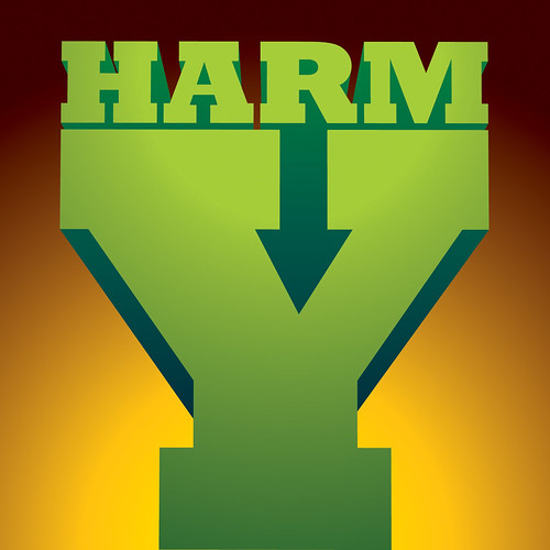
Harmony
Here is my Word It submission for April. This month's word is Harmony: a consistent, orderly, or pleasing arrangement of parts; congruity. In addition to interpreting the definition, I did a little deconstruction. Harmony became Harm/on/Y, so I literally placed the word harm onto the letter Y. I also considered a treatment where harm was being done to Y, but then remembered I was at work, and if I didn't get back to my billable projects, harm was going to be done to me. Enjoy.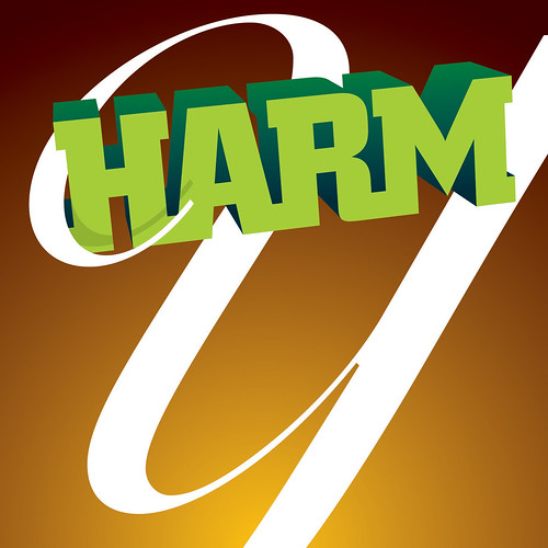
December 12, 2007
What type am I?
 My obsession with Typography is overwhelming. I often interrupt my girlfriend, Julie, mid-sentence to enthusiastically point out a billboard type treatment or poor use of Helvetica on public signage. She humors me by feigning genuine interest, and I appreciate her all the more for it.
The latest trend in typography; chunky, geometric, illustrative wording with the counters removed, has me both enthralled and perplexed. When executed well it can make a bold graphic statement, but it also has the allure of a fad so ostentatious that it's days are numbered. In spite of my better judgment, I found myself so caught up in this über hip typographical style that I started re-designing the Studiostein logo in it. It took me only about an hour to render all the letterforms—an indication that this style doesn't require exceptional finesse. I knew there was tweaking to do, but I felt confident in the design overall. So I presented it to Julie, who I jokingly refer to as my Art Director (I pretend it's a joke, but she's actually very deserving of the title) and waited with baited breath for her response.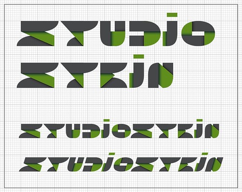
Okay, my breath wasn't actually bated. I knew Julie would see through the stylistic excess and realize that this type treatment didn't actually connect with the Studiostein identity. She was right.
Eye magazine creative director, Nick Bell, wrote that there are two types of designers; "agents of neutrality" and "aesthetes of style." While I often fantasize about being the latter—designing exclusively for the sake of expressing my raw creative vision—I think it's more accurate to concede that my purpose as a designer is to communicate the client's message. I reserve self gratification for one side project in particular: The Propagandizer.
While I'm still trying to develop a unique visual language to call my own, this exercise (and Julie in particular) helped me remember that my style isn't dictated by fads. I think it's critical to stay current on design trends and to incorporate them sparingly, but in the end they all pass.
November 15, 2007
Word it for November
Drumroll please…here is my Word It submission for November. This month's word is Next: coming immediately after the present one in order or space. As if enough typographic solutions to "next" involving arrows and X's hadn't already been submitted, I proceeded boldly with my own take on the arrow-X treatment. Is this X headed in next, or is it headed out? Ponder that.
November 4, 2007
My Favorite Typefaces
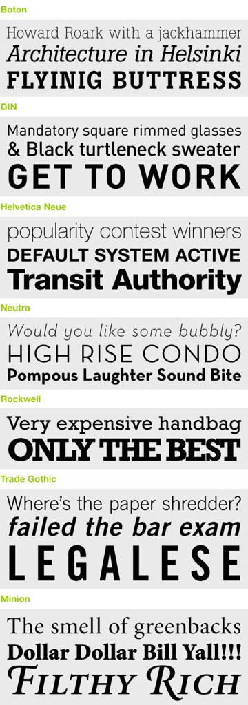
My original intent was to begin this post with a butchered rendition of "My Favorite Things" reinterpreted to express my love for all things Type. But I figured everybody involved would be better off if I forgo the shenanigans and dive straight into the post. There are many typefaces that I love, but these are some I've found popping up in my work frequently over the last five years. The obvious trend—lots of slab serif or no serif at all.
October 16, 2007
The Edit Aesthetic
I just finished a small stationery re-design for a non-profit association that, in their best interest, will remain anonymous. The back of the letterhead features a list of all the board member names which require annual updates. Herein lies the subject of this post. This particular client constructed an elaborate and aesthetically satisfying piece of her own by listing the edits in a Mind Map-ish sort of way. I love the look of it and in spite of the visual complexity, I understood it all.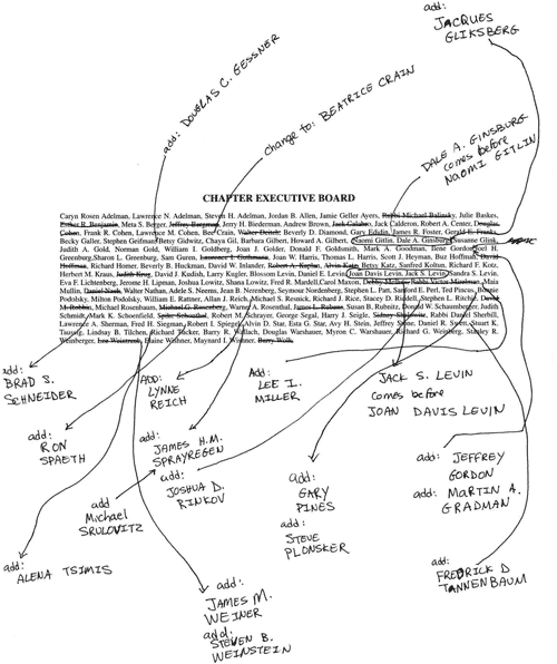
February 23, 2007
Talent out the wazoo
 Since the subject of type in motion has been on my mind a lot lately, I feel the need to point out a killer piece of work that I found via Design Observer. This class project was created by Jarratt Moody, a student at Savannah College of Art and Design, which reminds me—students who produce work this good piss me off. I don't know how long Jarratt has been has been designing for, but his resumé doesn't cite any experience prior to 2004, so I assume it hasn't been long. No student work should be this good. Granted, I haven't been designing much longer then he has, so I should probably shut up and create something genius to feel worthwhile again.
February 11, 2007
Thank you for perfect typography
 Even though this has been written about on several other blogs, I'd like to give kudos to Shadowplay Studio for creating one of the most typographically perfect opening sequences I've seen in a long time in Jason Reitman's comedy, Thank You for Smoking. With smooth transitions, vibrant colors, and fabulously executed type they cleverly weaved together a sequence rich with vintage iconography that nearly upstages the very movie it opens.
Another often talked about opening sequence that I'd like to throw in for good measure is that of David Fincher's thriller, Panic Room. This is a case where, for better or worse, the opening does indeed upstage the movie. If you haven't seen it, or just haven't seen it in a while, you should give it a viewing.
Subscribe to:
Posts (Atom)
