We all have tough months. Mine was February. The aftermath of the holidays, some unexpected expenses and a dip in freelance work left my wallet thinner than usual. I can handle living on a shoestring. However, my fiancée's birthday just happened to coincide with this perfect storm of financial wallops, leaving me empty handed in the gift department. Not good. So this year, in lieu of an actual gift, I designed her this five panel, vertical accordion folding card and she loved it.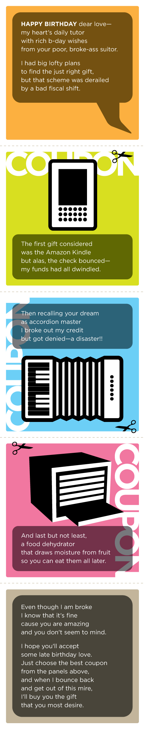
Showing posts with label illustration. Show all posts
Showing posts with label illustration. Show all posts
February 20, 2009
Julie's Pseudo Birthday Gift
April 10, 2008
Harmony
Here is my Word It submission for April. This month's word is Harmony: a consistent, orderly, or pleasing arrangement of parts; congruity. In addition to interpreting the definition, I did a little deconstruction. Harmony became Harm/on/Y, so I literally placed the word harm onto the letter Y. I also considered a treatment where harm was being done to Y, but then remembered I was at work, and if I didn't get back to my billable projects, harm was going to be done to me. Enjoy.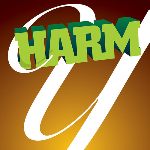

April 4, 2008
Illustrating the Holidays
On a rare occasion I get to wear the hat of an illustrator. Its something that I always enjoy, but hardly ever have the opportunity to do. Consequently, I've never developed my own style of drawing. Yesterday I was asked to create some holiday related marketing pieces. The client was intent on focusing the design around highly obvious holiday subjects: Santa, turkey, fireworks, and so on. I learned quickly that the royalty-free stock photography reserve of holiday themes is just downright bad. I figured, the only way to make this project work without compromising too much on aesthetics was to embrace the cliche and illustrate them by hand. Here are a couple of the illustrations that were settled on:

March 7, 2008
Revolution
Here is my Word It submission for March. This month's word is Revolution: a forcible overthrow of a government or social order in favor of a new system. I had actually been developing this icon as a new logo for the Propagandizer, but decided instead that it was better suited for this purpose. Enjoy.

December 21, 2007
Happy Holidays
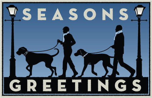
Just a quick note to wish you Happy Holidays and say thanks for visiting my blog. This site rarely gets more than 10 hits in any given day, but I value each visit more than you know. Above is a slightly adapted version of the post card that Julie and I sent out to our usual holiday mailing list. Thank you to Michael Schwab for providing the inspiration.
December 12, 2007
What type am I?
 My obsession with Typography is overwhelming. I often interrupt my girlfriend, Julie, mid-sentence to enthusiastically point out a billboard type treatment or poor use of Helvetica on public signage. She humors me by feigning genuine interest, and I appreciate her all the more for it.
The latest trend in typography; chunky, geometric, illustrative wording with the counters removed, has me both enthralled and perplexed. When executed well it can make a bold graphic statement, but it also has the allure of a fad so ostentatious that it's days are numbered. In spite of my better judgment, I found myself so caught up in this über hip typographical style that I started re-designing the Studiostein logo in it. It took me only about an hour to render all the letterforms—an indication that this style doesn't require exceptional finesse. I knew there was tweaking to do, but I felt confident in the design overall. So I presented it to Julie, who I jokingly refer to as my Art Director (I pretend it's a joke, but she's actually very deserving of the title) and waited with baited breath for her response.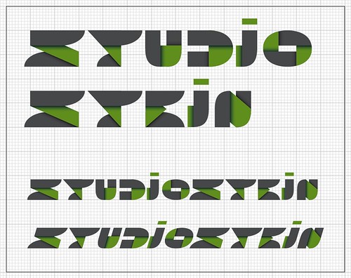
Okay, my breath wasn't actually bated. I knew Julie would see through the stylistic excess and realize that this type treatment didn't actually connect with the Studiostein identity. She was right.
Eye magazine creative director, Nick Bell, wrote that there are two types of designers; "agents of neutrality" and "aesthetes of style." While I often fantasize about being the latter—designing exclusively for the sake of expressing my raw creative vision—I think it's more accurate to concede that my purpose as a designer is to communicate the client's message. I reserve self gratification for one side project in particular: The Propagandizer.
While I'm still trying to develop a unique visual language to call my own, this exercise (and Julie in particular) helped me remember that my style isn't dictated by fads. I think it's critical to stay current on design trends and to incorporate them sparingly, but in the end they all pass.
November 26, 2007
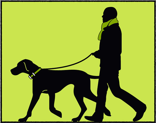
Studying Schwab
Back in school we used to get away with replicating other artists' signature styles by deeming the work a "study". This practice was often encouraged, but as we became upperclassmen with unique visual styles of our own, it died out.
For this year's holiday card Julie and I decided to revisit this activity and borrow the charming and timeless look of Michael Schwab's illustrations. While I will refrain from posting the finished card design, here are the studies: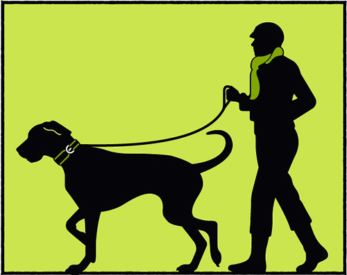
Subscribe to:
Posts (Atom)
