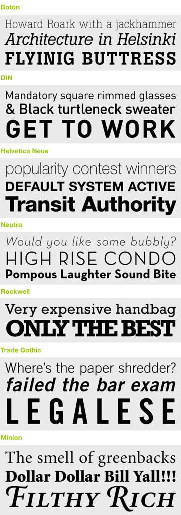
My original intent was to begin this post with a butchered rendition of "My Favorite Things" reinterpreted to express my love for all things Type. But I figured everybody involved would be better off if I forgo the shenanigans and dive straight into the post. There are many typefaces that I love, but these are some I've found popping up in my work frequently over the last five years. The obvious trend—lots of slab serif or no serif at all.

4 comments:
oooh I like those fonts too! Are any of those on my site? hmmm.... I look forward to seeing more cool fonts, thanks for posting!
Thanks! None of those typefaces are on your site but I seriously considered Barmeno and Bernard Condensed — both used in your logo and print materials. Yes...more to come.
Hmmm. Yes, I dig these typefaces as well. Egyptian slab serifs are definitely growing on me (a la London's Guardian newspaper -- a REAL masterpiece in typography, BTW). I'm also loving the typefaces from H&FJ's Proteus Project. Great for display and headlines!
I discovered the Guardian just recently, and yes, the typography is fantastic. If you haven't seen it, you should check out www.newsdesigner.com. A great website devoted to newspaper typography and design.
Post a Comment