Whether beautifully rendered or just noteworthy in their junkiness, these typographic finds always seem to catch my eye. Here is the first part in an collection of photos of found type from my neighborhood—Lakeview, Chicago.
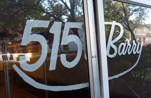
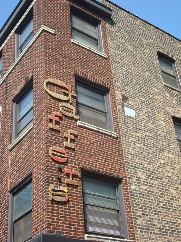

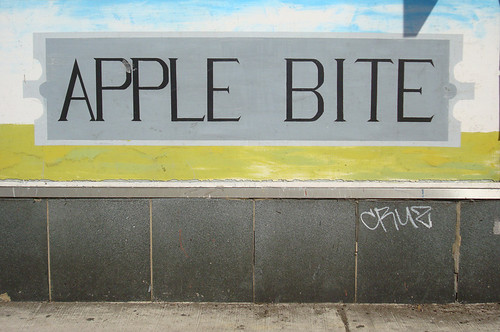
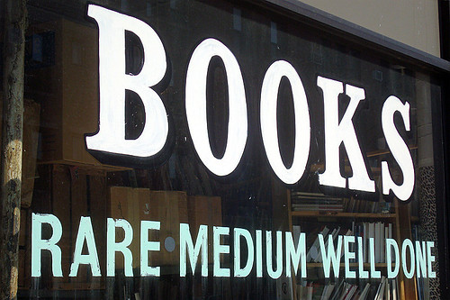
Whether beautifully rendered or just noteworthy in their junkiness, these typographic finds always seem to catch my eye. Here is the first part in an collection of photos of found type from my neighborhood—Lakeview, Chicago.
Here is my Word It submission for September. This month's word is Serendipity: the occurrence and development of events in a happy or beneficial way. I took a very simple approach to this. Enjoy.

 I just want to take a moment to announce a new project that my girlfriend Julie and I are starting called the Propagandizer. Click here to check it out. Spurred by the fulfillment of designing the 9/11 General Strike Poster, we are launching this project as a small contribution to a world desperately in need of change. I for one have never been the type of activist to march in rallies, stage sit-ins or throw eggs at the presidential motorcade, so we believe this undertaking will drown out any other attempts we could make to have our voices heard.
On a continual basis we will post original propaganda that you can download, print & post in your neighborhood if you are so inclined. If you disagree with the point of view expressed by the Propagandizer, let us know (as I'm sure you will). If you wish to contribute your own propaganda, please do so. Prepare your artwork as a PDF file and email it to this address. Please keep the file size below 5MB.
I don't delude myself that visitors to this blog want to read about my political leanings. This little corner of the internet is about design, not politics. I am neither learned in the political sciences nor thoroughly up to date on world affairs. My political convictions are based largely on what I hear on NPR a couple times a week, what I see in the headlines of CNN.com, and what I feel in my gut when I take all this, and much more into consideration. That being said, I promise to keep all political ramblings to a minimum.
At the urging of my gut, and aided by a strong desire to do more "extracurricular" design, I created this poster to promote the 9/11 General Strike. Whether or not they include it on the official website for download by the public is yet to be determined, but you can download the full size PDF here, print it and post it in your neighborhood if you are so inclined.
Regardless, it felt good to break from client projects and create something that reflects my personal convictions. While I don't think that design alone can change the world, I do believe that it is a critical tool in bringing about political, social and environmental progress.
I ride my bicycle every day: to work, to client meetings, back home, the grocery store, the bar, wherever. It's a large part of how I define myself—my own personal culture. I ride a messenger bike and I wear a messenger bag and I roll my jeans like messengers do. In spite of this, I am not part of the messenger community. Nevertheless, I enjoy observing this rapidly growing, always proud, and often arrogant group of cyclists in all their tight-pants glory.
One detail of messenger culture has always intrigued me; spoke cards. Used to identify competitors in alleycat races these cards are one of the few points where print design and messenger culture intersect. Here are some of the more artistic spoke cards I pulled off the web for your viewing pleasure.


Less is definitely more. The Coca-Cola Company proved that with the recent enema it performed on the famous Coke can. This simple redesign turned out to be one of the best product packaging overhauls of the last several years, and it is one that will go largely unnoticed by the general public. Instead, consumers will experience a barely detectable sense of nostalgia and perhaps an enhanced connection to the bubbly beverage, and nothing more. Why such a slight consumer reaction? Rather than slapping swooshes, splashes and halftone patterns onto the design, they removed extraneous design elements and, in so doing, returned the Coke can to its long-ago simple glory.
In a marketing milieu where corporations flood the public with visual noise, a move like this from such a large player should be applauded. Now Coca-Cola actually deserves the name "classic".
On the other end of the boxing ring stands Pepsi. Now I should probably mention that I have little conviction about which is a superior soft drink. My girlfriend Julie feels very strongly that Coca-Cola is the apex of all beverages. Because of this, no Pepsi can has ever seen the inside of our refrigerator. That notwithstanding, Pepsi's latest marketing effort takes the exact opposite approach as Coca-Cola, and quite frankly their new cans turn my stomach.
Adorned with flashy, urban patterns this suite of 15 unique designs attempts to speak directly to young consumers in what Pepsi calls "a salute to the spirit of youth and discovery". Unfortunately, these cans only succeed in widening the gap between mega-corporation Pepsico and it's consumers by trivializing youth culture with graphics of car rims, snowboarders and DJs. For Pepsi's full spectrum of youth culture clichés, click here.
Before I dive into this post, I'd be remiss not to make a quick address. I'm a bad blogger. It's true. The only excuse I can present for being such a sporadic author it that, at the detriment of my blog, I've been highly productive in other areas of my life. So to any of you out there who actually look forward to my posts—if there are any of you out there—I apologize for keeping you hanging.
Back to the news. I have an online fetish. It doesn't involve web cams, internet porn, or Myspace. No, this is much more highbrow than any of that. It's the news. CNN.com to be exact. Why the sudden interest in world affairs? Well, its never looked so darn good before. CNN.com went live with their newly designed website early this month and has set a new standard for news coverage on the web.
I won't even begin to mention the myriad technical ways that the site has been improved. For more on that check out Andy Rutledge's article "Quiet Structure". I will however say that CNN definitely knows how to clean shop. The ease of understanding has been vastly improved. Before the viewer would have to tediously sift through the stacks of often strangely worded headlines. Now, with so much less visual noise, the content finds you. This transformation perfectly illustrates the value of thoughtful design.
