I want to take a moment to announce the relaunch of moveseniors.com. The previous iteration of this website was confusing to navigate, visually unappealing, and lacked a sound information architecture. Important content was difficult to find and a wealth of text was rendered as images—hidden from search engine spiders. Our goal with this redesign was to improve SEO, ease of navigation, accessibility and overall friendliness
The site needed to provide resources for aging adults transitioning into smaller homes while also serving as a training portal for aspiring senior relocation professionals. My roles in this project included information architecture planning, front end design, (X)HTML/CSS construction, Javascript implementation and content management. Click here to launch the site.
March 26, 2009
MoveSeniors.com redesign
March 25, 2009
Moved by type
Beautiful typography, thumping backbeats, retro aesthetic. Does it get any better? This "typographic orgy" from Sebastian Lange rocked my world when I first saw it. Clearly I'm a sucker for typography in motion. But this video experiment for the song "flickermood 2.0" by FORSS turned me into a full-blown junkie.
Labels: design, motion graphics, typography
March 7, 2009
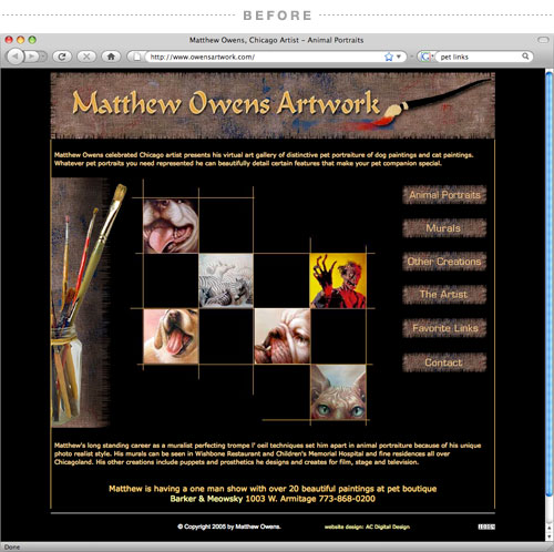
OwensArtwork.com Gets Painted Anew
As a gift to my good friend and celebrated artist Matthew Owens, I offered to redesign his website. The previous iteration didn't reflect his sense of style or personality in the least. It felt like someone altogether different—a crafty homebody masquerading as the erudite, talented and slightly peculiar artist that many Chicagoans know and love.
Unfortunately, politics got in the way of launching the redesign and kept it in a holding pattern for the last year and a half. That is, until today. The new version of owensartwork.com launched with dark motifs of moody grays, painterly details, and a background scanned straight from a Jean Paul Gaultier shirt—nothing could be more Matthew than that.


